Our own product
Begin with a receipt. Make the product understandable.
Basket is our own grocery-comparison project. Its presentation begins with a familiar object: a receipt. The aim was to connect that everyday action with the product screens and its comparison principle.
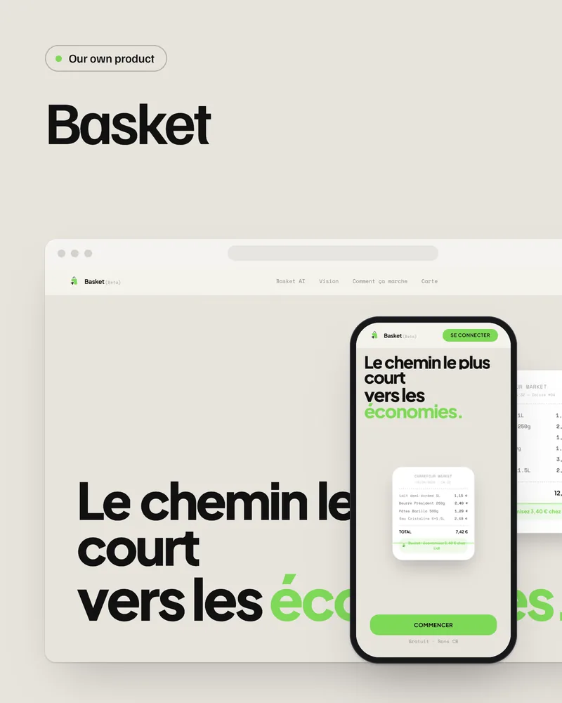
Our own product. Accounts and live data are disconnected in this preview. No usage figures or financial gains are claimed.
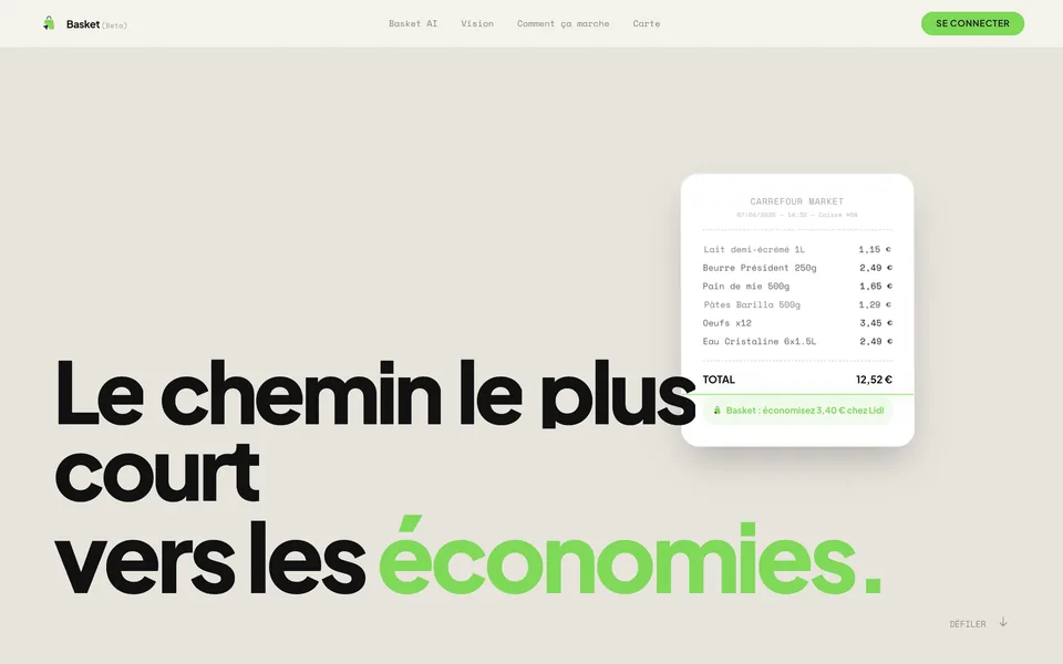
A familiar starting point.
The receipt makes the product concrete. The homepage explains the principle before the detail, without asking visitors to start with an account or a technical feature list.
A sequence of real screens.
Reading a receipt, comparing and reviewing form the presentation’s thread. The screens illustrate the project; they do not establish live price coverage or achieved savings.
Continuity across website and film.
Both supports share a visual direction. The film guides attention while the website leaves room for exploration. The portfolio uses Basket’s actual original homepage components.
Preparing a product launch?
Let’s make its principle and uses easy to understand.
Let us talk about your project.
30 minutes on a video call to see what your site can bring you.